

Typesetting
Or what you don’t notice is most important
Typesetting is the art of ensuring that text layout is both aesthetically pleasing and supportive of the reading process. All print publications, from menus to novels, from newspapers to academic textbooks, require typesetting. The word itself is an example of one in which the meaning has gone beyond the original sense, but that change has only been recent.
The Times and the Wapping Dispute
I remember a visit to the House of Commons when I was a sixth- former. We watched the emergency debate on the threatened closure of the Times newspaper, at the time regarded by many as a part of the establishment. The management wanted to replace traditional typesetting with a more modern alternative and the unions were refusing to accept the proposed changes. The dispute closed the paper for almost a year and cost the owners an estimated £30 million. It contributed to the decision to sell the paper to Rupert Murdoch, who, of course, took the issue to the next stage and announced that, in future, journalists would enter text directly into computers. This decision determined that typesetting would, in future, be a task for digital layout designers; the old typesetters would be redundant. The famous 1986 Wapping dispute that resulted was definitive not just for typesetting, but for union power.
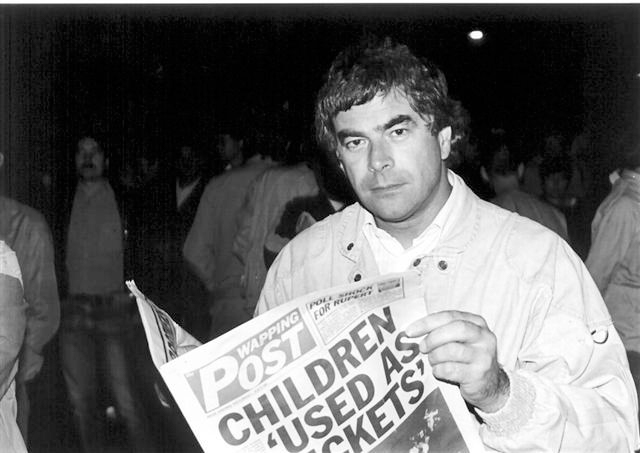 Tony Dubbins, General Secretary of the NGA, on the picket line during the Wapping dispute*
The previous major revolution in typesetting had been the introduction of the linotype machine, invented in 1884. Prior to that, all printing was reliant on the typesetter arranging individual metal letter types (sorts) in order on a composing stick. This had restricted ephemeral publications like newspapers to just a few pages. The linotype machine allowed the typesetter to enter up to 90 characters at a time into the machine, which then punched several lines of type into hot metal, producing the raised pattern for typing. Despite the availability of phototypesetting since the 1960s, in 1986 this was still the approach being taken at The Times. A skilled typesetter not only required speed of eye and hand to reproduce text quickly, but the ability also to make judgements about what worked on the page.
Letterpress
The original single type or form arrangement of typesetting persists in letterpress printing. This is regarded now as a traditional, artisanal craft. Letterpress has an aesthetic appeal especially appropriate for special events and is particularly popular for weddings. The Yorkshire Wordwright recommends www.phyleciasutherland.com for anyone interested further.
Phylecia comments that:
Letterpress is a specialised printing technique. It is a handmade product and I am the craftswoman. By the time a product is finished, I will have handled and inspected each piece several times. I’m as meticulous as one can be with a vintage process.
Modern typesetting
Reading is first a visual activity and a well set out text is crucial to support the reading process. Good text design is intended to be largely unnoticed, so that reading is undisturbed and efficient. Even if the typesetter receives the copy flawlessly proofread, there is still much to consider. A design mistake will inhibit a good reading experience and getting the text layout right is a sign of professionalism and quality.
Examples of what will be considered include:
Fonts
- The choice of font is important both for readability and signalling. Serif fonts are more commonly used in longer publications because they are regarded as more readable; the serifs are said to allow the letters to flow visually into each other in a cursive fashion. Sans serif fonts are more often used in advertising and short publications as they are more instantly legible. When we blogged on London Underground design we were careful to acknowledge the importance of the new Johnston sans font:
http://www.theyorkshirewordwright.co.uk/blog/test-of-time/
A short blog on font choice can be found at:
www.awai.com/2011/10/the-best-fonts-to-use-in-print-online-and-email/
- Font size is traditionally between seven and 10 points; the precise size needs to be chosen with other issues in mind. Some publications will require different sizing for emphasis.
Punctuation
- Punctuation formatting for continuous prose has certain traditions and these are usually respected to avoid the punctuation being visually awkward.
Layout
- Where possible, the stacking of words should be avoided; when two or more adjacent lines have identical words in similar positions the reader can jump text and become confused.
- Spacing of the text is crucial. This can include the obvious of line spacing, which must be just right to aid readability.
- Margins should be generous enough so that the text has the right amount of space all around it, allowing the eye to move comfortably from one line to the next while reading.
- Poor spacing can include loose lines with too much white column space. As a general rule a typesetter would use at least three to four lines to begin or end a column to avoid an unappealing irregular appearance.
- ‘Word widows’ are the short lines left at the end of a paragraph which look clumsy and slow down reading; they need to be avoided.
- The spacing between headings and titles and the main body of text also needs to be considered to introduce emphasis, but also avoid both confusion and visual awkwardness or asymmetry.
- Sentence length distribution may require liaison with the copywriter or author, as brief sentences at the end of columns or paragraphs can be visually uneven.
- Justification and alignment are also crucial. In a menu or flyer, for example, the designer has freedom to vary this for effect. In lengthier texts, the aim is for neatness and perfect alignment.
The Yorkshire Wordwright has developed significant typesetting expertise. We have particularly found ourselves producing menus for cafes and flyers to advertise local businesses.

The menu above was produced for our friends at The Cookhouse café in Haworth. Because there was a lot of text to fit onto an A5 simple folded layout, an early decision was taken to design a separate and distinctive drinks menu.
The text was still dense, however, and so, whilst only two fonts were used for legibility and stylistic integrity, two colours and the use of bold and italics were used to give the reader additional help in navigating the various elements of the menu. In most cases, the prices were offset to make the text column wider and the price amore obvious; this was not always possible and so this rule was also broken occasionally for aesthetic balance. The headings are in the serif Trajan Pro 3 font, which was inherited from a previously designed branding; the text body is in Mach font, a sans serif font chosen for legibility, whilst also visually complementing the Trajan font.


