

Design and the test of time
Or finding a relic of London in a bag
I recently acquired a bag of possessions that belonged to my grandfather. Amongst the photographs and the diary entries there was a fold-up pocket map of the London Underground. For me a wonderful discovery, it sent me back to reading again about the way in which London Underground blazed a design trail that still affects us today.
A 1926 map
The card is very different to the current map. Upon investigation, it turns out that the card must be from between 1926 and 1932. It shows a completed Northern line extension to Morden, which was opened in the earlier year and the design was replaced by its famous successor map in 1933. The design itself is by FH Stingemore, an established London Underground designer and strikes a balance between design clarity and a desire to faithfully represent the geography of the line. Thus the longer distances between outer London stations are reproduced as larger gaps between stations on the map. Similarly, more significant track curves are also shown on the design. At the same time, the new Johnston sans lettering is hand drawn in and a wish to do this to achieve good legibility has had an impact.
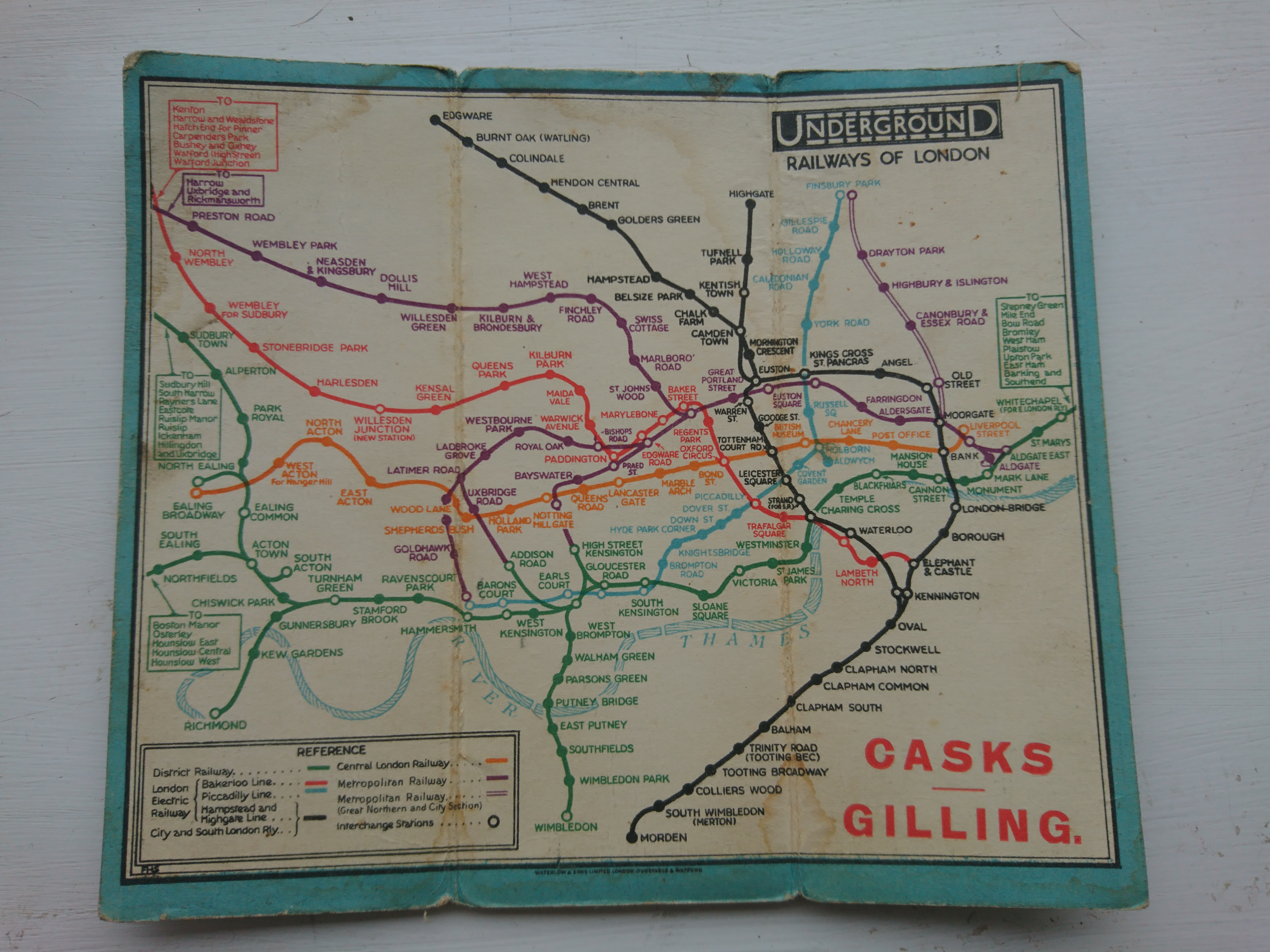
Prominent in the top right hand corner is the Underground logo. It has since been modified, but nevertheless, has stood the test of time, for, again, the typeface is Johnston sans, a design which is still in use today and which many consider to be the most significant, and maybe the best, sans serif font. On the front of the fold-up map, the brilliance of the design is even more obvious. The new type is paired with the open ring first introduced at the same time in 1916, and used on maps from 1919.

Johnston sans
Frank Pick, the commercial director of London Underground from 1912, commissioned Edward Johnston to design a new letterform for the network and Charles Holden to create new station buildings. The intention was to build on the design unification of the previous few years and to establish a boldly twentieth century face for the underground. His vision was based on a clear, and now famous, principle: “the test of the goodness of a thing is its fitness for use.”

The new Johnston typeface was influenced by the designer’s experience as a calligrapher – he drew the first version of the lettering – perhaps by his ex-assistant Eric Gill’s knowledge of sculpture, and certainly by Caslon’s English Egyptian letters of 1816. It is monoline sans serif, carefully designed to allow for no misinterpretations, for example between lower case l and the numeral 1, to be easily made, reproduced and recognised. It is certainly fit for use: it makes my grandfather’s map names easy to read. It also looks modern and must have done so even more in 1926. The brand message was clear.
Harry Beck’s map
The map my grandfather used was very quickly usurped. The commercial director was quick to see the potential of a new map design sketched out by Henry (Harry)Beck in 1931. Although the abandonment of geographical accuracy had been done before, the new map is generally held to be a triumph in its placing of the passenger’s use of the map at the centre of the design. To do so, it equalises the station spacing and removes the distraction of representational line curves, giving us the basis of the map still used today. It is so clever, and such a cartographic achievement that, even with the addition of many new lines and zonal information, it still works. Recently the new Elizabeth Line map was unveiled; the design still allows us to read the map quickly and easily.
Together, the three legs of Underground design, now used for all London transport: circle logo, Johnston sans and Beck map, form a pleasing and unified whole. And achieving that unity is the graphic designer’s challenge.
The best easy to read survey of London Underground design that we know is ‘London Underground By Design’ by Mark Ovenden. It’s a great read.
A map of the new Elizabeth Line can be found at:
tfl.gov.uk/travel-information/improvements-and-projects/elizabeth-line
Font nerds will appreciate the article comparing Johnston sans and Gill sans at www.typotheque.com/articles/re-evaluation_of_gill_sans


