

The Joy of Book Design
The Joy of Book Design
Books communicate stories, ideas and information. But they should also be beautiful objects. Their design must be both unobtrusive – allowing the text and images to speak – and pleasing on the shelf or coffee table. In book design, therefore, the challenge of marrying function and form parallels that of designers in other fields; it is why we, at The Yorkshire Wordwright, have fallen in love with it.
The Yorkshire Wordwright was established as a branding and communication business and. early on, we found ourselves designing websites and corporate communications. We had not considered book design. Then, last year, we were approached by another, new, Otley business – the wonderful Little Peak Press – and given the opportunity, because of our local connections, to design their first book, Heather Dawe’s High Inspiration. Since then, we have designed another three books for Little Peak and one for Otley Town Council. We have learned a lot. This article is an attempt to share some of our learning, show you why book design is so much fun and allow you to appreciate the books on your shelf just a little bit more.
The concept
Every book has an author, and it is in the author’s mind that the design begins. The essential concept of the design might be found in the words of the book, but it may also, where the book is new and the author involved, come out of discussion. We have appreciated working with this process. For Traceless, written by Geoff Cox and Heather Dawe, the authors came with a definite brief: the book was to be a celebration of The Charnley Run in anecdote, painting, and poetry, and the book design should reflect that patchwork.
The cover
A cover captures the essence of a book and informs the reader of what to expect from the book itself. By doing that in a striking way, the cover will sell the book. And that, of course, is the point.1
Usually the cover will be designed first, and the book concept encapsulated there. This will then inform the design of the pages. In discussions about Traceless, we agreed that the cover design should be a collage. To interpret that, it was necessary to find a combination of images, text and colours that gave the feel of laying out material on a table or board as plans were made for an outdoor adventure. Some designers would do that literally – tearing, cutting and laying out on a surface. However it is done, it involves a combination of experience – understanding colour palettes, knowing about fonts – intuition, and trial and error.
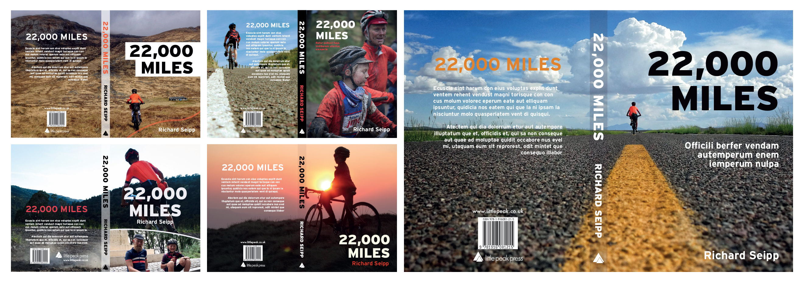 A few of the original design ideas for Rich Seipp’s 22,000 Miles, plus the first version of the design that was chosen to be the final cover.
More usually, the cover will involve the choice of one image – a photograph or an illustration – to complement the title. The same considerations apply. The cover must be striking and pleasing, but must also covey something of the author’s concept and the genre of the book– adventure, mystery, travel, art, history… The bookshop browser must be drawn in and drawn to read. They must also want it in their house. With Rich Siepp’s book, 22,000 Miles, we knew that the cover needed to consist of one striking photograph which would convey the sense of journey and adventure within the book. We chose a few possibilities and discussed these with the author and publisher, allowing Rich to have the final say.
The Layout
Text Layout
Document and book pages are organised in grids and with hierarchies to direct the reader and to support intelligibility. Typically, a book is laid out simply, in manuscript form, mimicking the original writing or typing, with the text enclosed within a rectangular space and surrounded by a consistent margin to aid both readability and printing. A webpage or magazine is far more likely to employ columns and modules, either regularly or with variation. There are rules, but they can be broken. Indeed, once a rule is understood, it can more effectively be broken.
In the first two books we designed for Little Peak, the text kept to a manuscript layout. Rule breaking was confined to chapter pages, where inconsistency was deliberately employed to reflect the character, expression and dimensions of Heather Dawe’s paintings. Typically, book images and text are forced into a pattern, but for these free-flowing books, that seemed wrong.
In Traceless, the concept of the book encouraged us to go further and embrace a variety of layouts. Poetry was justified centrally or to the right according its content and the wishes of the authors. Prose was arranged in a conventional manuscript style. But, where a painting justified a bit more space, we pushed the prose into a column, just because we could!
Integrating text and images
 The integration of text in different fonts and an image which breaks manuscript ‘rules’ in Heather Dawe’s A Cycling Year
This is fun, for it opens up a world of possibilities. Conventionally, either text or images took precedence in different books, depending on whether the images complemented the text, or the text explained the images, but increasingly this distinction has broken down and the book designer gets to play around with layout. Considerations are the technical: ensuring that related text and images are together, fitting the images and text to page demarcations and ensuring that image quality is reflected in image size, but also aesthetic: ensuring that rules of proportion and ratio are observed, deciding when divisions should be sharp and when blurred or overlapping. In Traceless, we got to place poetry text over the top of images, to overlap text and images.
Images may relate to the text clearly, but even so, they may need titles and/or explanatory notes. In the Little Peak books authored by Heather Dawe, Heather’s paintings are titled, as we know readers will want to know the location.
In 22,000 miles, by Rich Siepp, there are photographs on almost every page, serving the text by illustrating the stories and not needing titles. Yet the photographs are never less than dominant on the page and the design of the book had to let them speak and inspire – both through the landscape depicted, but also by complementing the tale of endeavour contained in the words. Some photographs were given extra room by spreading across pages; a last minute revision was required in one case to ensure that the rider – Rich’s son, Tom, who is the star of the book – did not disappear into the gap created by the spine. Another photograph, emphasising the movement of a cyclist, is allowed to break through the manuscript border in order to strengthen the sense of movement and allow more space.
Hierarchies and Navigation
In fiction, the emphasis tends to be on continuity of reading. The designer respects the author’s desire to take the reader to another place and keep them there. Discontinuity will be author directed for particular narrative impact. In non-fiction, the designer will often play a more significant role in guiding the reader with navigational aids. Demarcations will be authored directed, but it is the designer who interprets these. Text hierarchies and use of space denote the move from one idea, chapter or section to another and establish similarities and relationships between text content. Chapters or sections can have titles and/or numbers. The choice of colour and font for these markers is another chance for the designer to play around with expectation and convention and strengthen the feel of the book.
Contents pages, indexing and pagination need proper consideration. They are a chance to influence, as well as guide the reader. 22,000 miles is a book about journeys. Each chapter is a journey. The journey is reflected in the chapter pagination, which includes journey lines, an idea carried back onto the contents page. The journey concept had already been explored by Sky, Rich’s daughter and Tom’s older sister, in her brilliant maps, which we knew would be an important aspect of the book. We wanted to follow her lead and ensure the maps would sit comfortably into the book as a whole. We also took her lead on chapter heading typography; the offset colour printing gives a personality to the book and ties different aspects together.
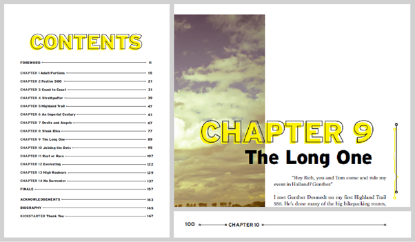 The contents page and a chapter heading from 22,000 Miles showing the journey referenced design
Type
Whole books have been written about type. Originally, type was metal letters and their arrangement in the forms used in printing. The fonts, from which type was constructed, were styled on calligraphic or writing forms and on classical inscription. Over time, more and more fonts were designed, reflecting the styles, fashions and needs of different times. Today’s designer has a huge library of choice.
And fonts should be chosen carefully. Fonts have different personalities, which is why you never see Comic Sans on a funeral notice…I will never not find it amusing that I can write something in Arial, hate it my very core, then switch the font to EB Garamond and think: this is a masterpiece.2
Type consists of font character, size, weight and character spacing or kerning. Fonts are available in families which provide the designer with a variety of related fonts. These can be confidently used together in roman and italic text and captions. Alternatively, the designer will pair complementary fonts, for greater variety.
In Traceless the font used for the cover title was Thunderhouse Pro, which we chose for its similarity to old, stamped typefaces. This was important to maintain the collage feel already discussed. To tie the whole together, this was also used for the numerals used for announcing the chapters.

Cover book name for Traceless
For A Cycling Year we used the English Grotesque font as it was very like the fonts by the Ordnance Survey and would be sympathetic to the map design of the cover and to the book concept.
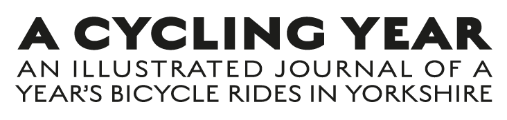
Cover book name for A Cycling Year
For text font, we have a couple of firm favourites for most projects. Body text needs to be easily readable, and despite the debate about this, we use Old Style serif fonts for this reason.
Serif fonts date back to the 1400s, and were inspired by the calligraphy of the day. The connection to the scribes can be seen in the rounded strokes and thick to thin lines. The serifs are placed at an angle, which makes it an easy-to-read typeface. Both in the “olden days” and today, the style was/is a favourite of newspaper, magazine and book publishers.3
For more reading on type, we recommend Ellen Lupton’s book on type.4
Reflection
Writing this article has been fascinating; it has caused us to dwell on the complex process of book design, which for Rhiannon, our main designer, has largely become intuitive – the result of learning on the job. If you want to follow in her footsteps, you will have to do the same. Enjoy it!
References
1 https://self-publishingschool.com/what-makes-a-good-book-cover/ and https://www.wix.com/blog/creative/2020/01/book-cover-ideas/
2 Hannnah Jane Parkinson: The Joy of Small Things, Guardian Newspaper, 7th November 2020
3 Figma Definitions: Serif https://www.figma.com/dictionary/serif/
4 Ellen Lupton, Thinking with Type: A Critical Guide for Designers, Writers, Editors and Students (New York, Princeton Architectural Press, 2004, 2010)


