

Signs of Safety
Or how good design saves lives
Between 1957 and 1963 Jock Kinneir and Margaret Calvert produced a graphic scheme for Britain’s road signage, their uniform and effective approach replacing a previous jumble of signs commissioned by many different organisations. Rightly, their work has stood the test of time and increased road use. It is now lauded as one of the most effective ever information design schemes.
We know that good graphic design makes life more appealing; a jarring shop frontage or badly put together poster often reminds us of this. At The Yorkshire Wordwright, unsurprisingly, we are great advocates of this importance of good design. A recent visit to the design museum in London and its showcase of Calvert and Kinneir prototype signage reminded us that its importance goes beyond the aesthetic; it can save lives.
Cars, cars and more cars
JB Priestley had written in 1933 of a new ‘England of arterial and by-pass roads, of filling stations and…bungalows with tiny garages.’ There was already an aspiration to enjoy the freedom and status that car ownership brought. By the war, Britons owned more than two million cars. After the hiatus of the war years, more and more families were able to take to the roads. In 1955, the number of miles driven on British roads rose above 50 billion for the first time. Over the next 10 years, this doubled. In 1955 the number of cars on British roads was 3.6 million, rising to nearly 9 million by 1965. Increasingly, too, goods traffic was moving by road. Speeds were also rising. Yet, unlike many other countries, Britain had no motorways and roads were little changed from the days of horse transport.
Slow progress had been made in developing ways of making roads safer. As long ago as 1930, the Highway Code was introduced and local authorities were given rights and responsibilities to order roads and provide traffic signs. But, with increasing speeds and increasing traffic, a new approach was needed. In 1949 an act of parliament allowed for motorways and the new Conservative government made the decision to spend the required money. Already an established graphic designer, with the design of Gatwick Airport signage to has name, Jock Kinneir was given the job of producing a scheme for the motorway signs. An ex-student of his, Margaret Calvert was his assistant.
Replacing a jumble of signs
In 1961, Typographica magazine published a photo essay by Herbert Spencer. It illustrated the wide variety in type and quality of road signs on a journey along the A3 and, by clear implication, the confusion and danger that this caused. The brief that Kinneir and Calvert held was extended to the complete road network. Now commercial partners, the job was also completed as a true partnership.
The designers were clear about the purpose of the scheme from the outset. Kinneir began with a question: “What do I want to know, trying to read a sign at speed?” Calvert confirmed that aesthetics were only a by-product. “You were driving towards the absolute essence. How could we reduce the appearance to make the maximum sense and minimum cost?” This approach produced a simplicity of outcome that was also unobtrusively appealing.
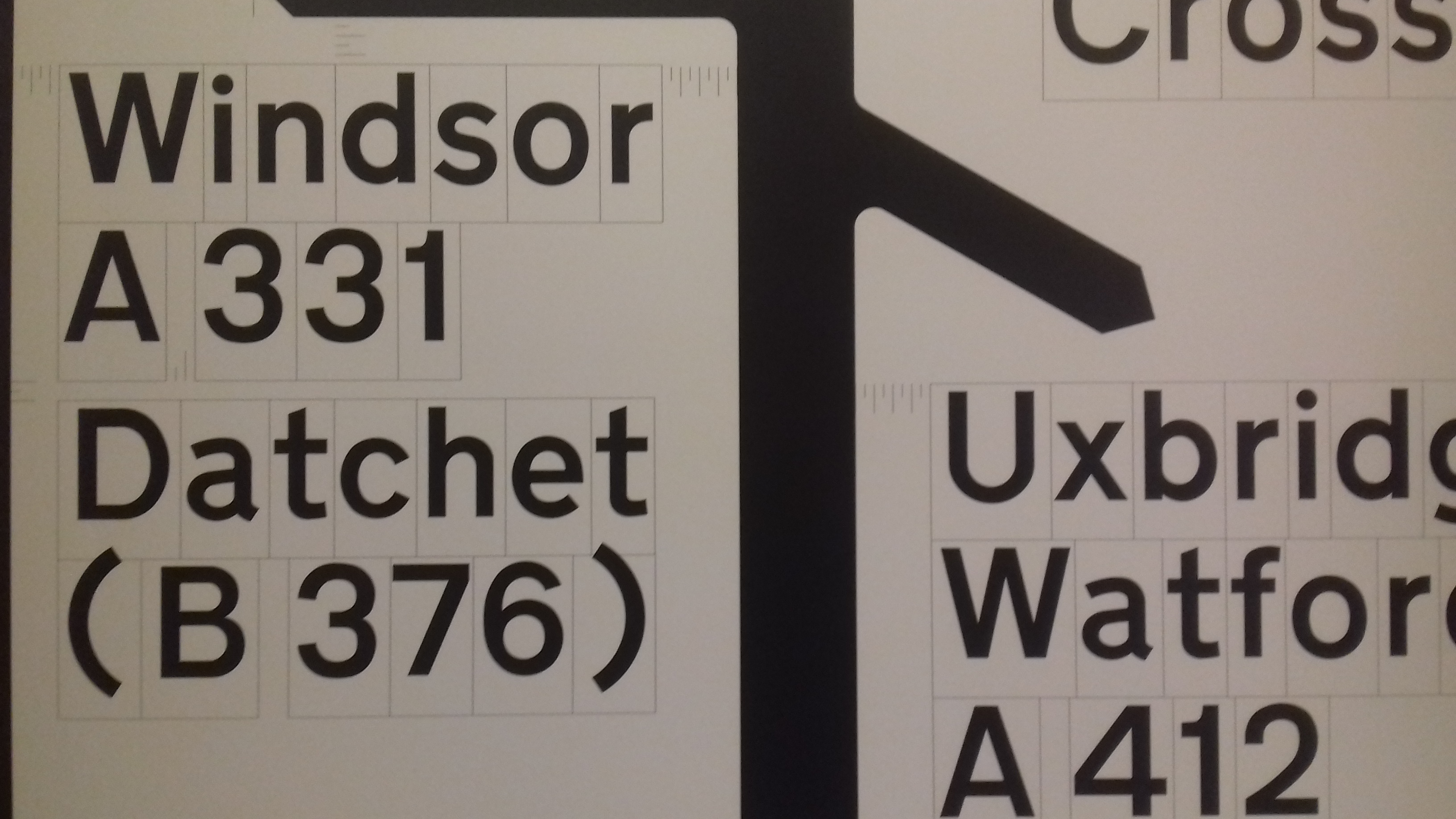
Original layout for the new map-style signs
Innovation was found in many signs being a junction map which gave advance information for fast vehicles. Previously, sign fonts had been capitalised. Again, aware of increased speeds, Kinneir and Calvert concluded from their experiments, that a mixed typeface – upper and lower case- would be easier to read. They chose a development of Aksidenz Grotesk. Later named Transport, it still appears as a modern sans serif font. It is more rounded and less aggressive than much lettering used on other countries’ signs. There were doubters and competitors. The outcome, in the words of the Design Museum was ‘Intellectually rigorous yet inclusive and engaging,’ and became ‘a role model for modern road signage all over the world.’
Although there have been small changes and significant additions, especially the brown tourist information signage, continuity has been testament to the original design quality. According to Phil Baines, professor of typography at Central St Martins, London, it is “a staggering achievement – a house style for Britain”. “On a project of that scale, you have to get it absolutely right. The fact it has lasted so long is testament to how right they got it.”
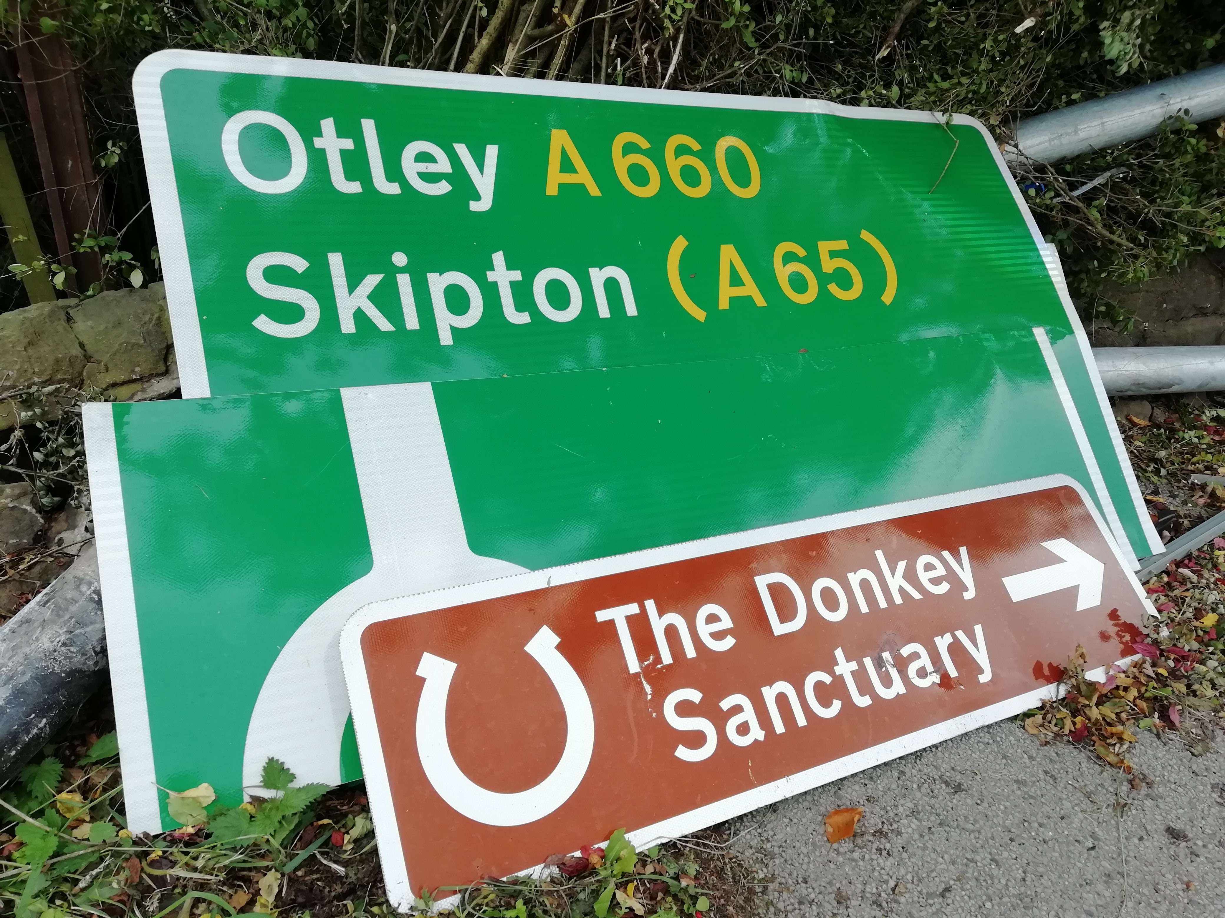
Going up, or coming down, continuity is the order of the day
We have grown to love the Kinneir and Calvert design, but more importantly, it will have saved many lives.
Sources and further reading:
https://designmuseum.org/designers/jock-kinneir-and-margaret-calvert#
http://www.britishroadsignproject.co.uk/jock-kinneir-margaret-calvert/
http://www.famousgraphicdesigners.org/margaret-calvert


