

Colour
Or pity the poor designer
Only a few days ago we were tight in the embrace of the ‘Beast from the East’. Looking out of the office window, the hawthorn hedge was bare and stark against a clean, bright layer of snow. Soon the same hedge will be bursting with a fresh green, full of the promise of summer. Colour and the combination of colour speak to us: aesthetically and emotionally.
Last week’s blog was about words. I love words and the craft of joining them to communicate. Rhiannon loves images and, especially, colour. That’s why we think we make a great team. To balance up our blogging, Rhiannon has persuaded me that this week’s thoughts should be about colour: to explore behind the designer’s colour palette. I have taken on the challenge and found myself amazed.
Complementary colours
Most of us will remember the concept of complementary colours from our school art lessons and what we recall is important and true – putting together different colours can be pleasing or jarring, depending on the choice. We probably learnt by using the colour wheel beloved of artists. This has red, blue and yellow primary colours arranged equidistantly around the circle and secondary and tertiary colours between, showing the impact of adding colours together: so red and yellow mixed become orange. In 1810, Goethe produced the wheel shown as part of his study into the effect of colours on the human observer, something artists had long intuitively grasped and something designers consider every day.
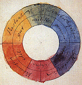
The colours on the left are warmer colours; paint your room orange (as we all did in the 1970s) and you may be able to turn the heating down a degree…The colours affect our emotions and can be chosen and used accordingly.
But the wheel also helps in the choice of colours to use together. On the simple art colour wheel shown, the colours opposite each other are complementary pairs: red–green, blue–orange, and yellow–purple. The impact of a colour is enhanced by its being placed next to its opposite. Look at a Van Gogh painting to see this being experimented with.
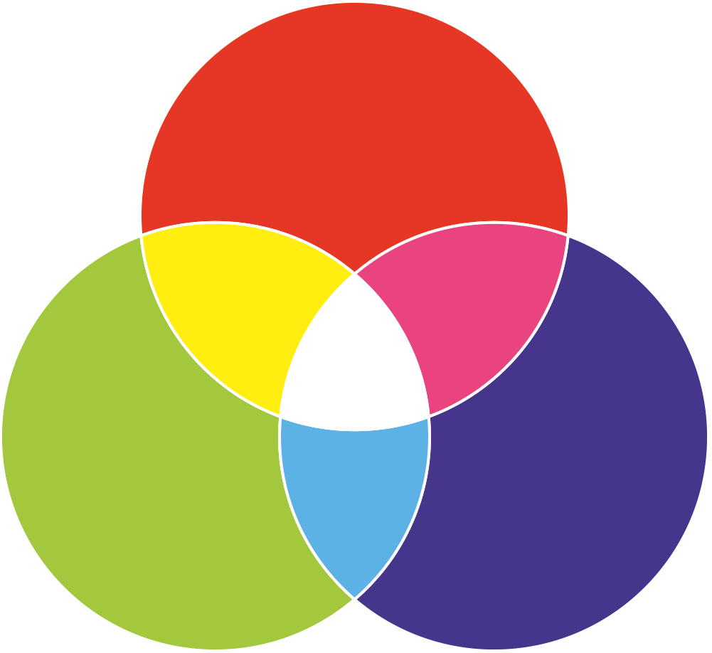
The truth still holds when considering the additive process of layering different colours of light. In this case, the primary colours are red, blue and green. These are combined to make new colours. When all are added together you get white, rather than the muddy brown obtained by over-enthusiastic young painters. Perhaps you remember a physics lesson when you refracted white light to make a rainbow of other colours?
Photographers and cinematographers also use the complementary colours to great effect. Consider this photograph by our associate Dave Zdanowicz. It is of the Chevin near our offices.
See how the pink/purple of the heather is wonderful against the green/yellow of the grass.

Tonal Value, saturation and hue
Relevant though this colour wheel theory is, the effect of colour upon the observer does not just come from the basic colour patterns. Most colour effects are, in fact, due to contrasts within three relative attributes in all colours:
- tonal value (light vs. dark)
- saturation (intense vs. dull)
- hue (the relationship to the key pigments of red, yellow, green, blue or to the wavelength of the light colour).
For a designer, this is crucial. The choice of a colour palette will be determined by all three aspects and the interplay between them in different colours. Rhiannon is currently redesigning a menu. The client had a logo, which was to be kept, but no brand guidelines in place. When considering which colours to use, the logo colour was the starting point. It determined all the other colours that could be used because of how its tonal value, saturation and hue would make the other colours look to the observer. Artists know this and that is why, for example, they might add white to a blue – light blue might be what they need to represent the world, but it might also be useful because of how it makes the other colours look, or the viewer feel.
The problem of the customer’s brain
This process can never be exact. Do you remember the internet dress colour sensation from two years ago? It was an example of how we all see colour differently. Our brains are designed to see in daylight, but daylight changes colour. The colour of daylight varies from the pinkish red of dawn, up through the blue-white of noontime, and then back down to reddish twilight. This is known as the chromatic daylight axis. We are constantly having to judge colour based on the amount and type of light we think comes from the light source and which is being reflected off the object. So if we think the light source is blue light, we will subtract blue from the colour of the object. In the case of the dress, the colour was able to be interpreted differently by different brains trying to make that adjustment. In a wired.com article at the time, Bevil Conway, a neuroscientist who studies colour and vision at Wellesley College in the United States, explained it as follows. “People either discount the blue side[of the chromatic daylight axis], in which case they end up seeing white and gold, or discount the gold side, in which case they end up with blue and black.” Whilst the dress is an extreme example, pity the poor designer working with a client who sees the world just that little bit differently.
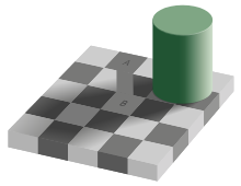
To prove that the brain is making these adjustments, consider the checked floor example recently seen on the BBC programme QI. In the picture we see square A as being darker than square B. In fact, they have the same lightness or brightness and would be printed with the same shade of grey. The brain interprets them differently because B is thought to be in the shadow of the green cylinder. The same colour tile would be darker in a shadow; because this tile is not, then we assume it is lighter. The jaw dropping moment is when we see the tiles joined. Even then, though, we are trying to make the adjustment. Weird!

Contrast from the same light and dark colours can be perceived differently by different people. A BBC article on wildlife photography in December 2015 quoted scientists studying visual perception at the University of Essex. They had found that as many as 20% of people are averse to repeated, irregular patterns of high contrast. It is suggested that this is because of a deep-seated memory of the danger from animals coloured in that way.
The poor designer
A designer needs to understand all this and to apply experience and customer research before choosing that final colour combination. It could, otherwise, all go horribly wrong. Which is another reason why Rhiannon does all the hard work.
For more about the dress, go to:
www.wired.com/2015/02/science-one-agrees-color-dress/
For a bit of fun, why not mess around as a designer, by trying out:
https://coolors.co/b2aa8e-0c1b33-7a306c-03b5aa-dbfe87
https://pigment.shapefactory.co/


